Packaging & Print: where premium is won or lost on the shelf
Thinking outside the box? Start inside it.
Elevating your brand packaging design is no longer the product's outer skin, but a crucial marketing asset that can optimize customers' behaviour and create brand loyalty in the right direction. The final impression of any retail shelf packaging is a potential customer's first impression, hence, it needs to deliver on every level, including visual characteristics, tactile finishes, interior consistency and structural detailing.
Did you know that consumers spend just 0.6 to 1.1 seconds noticing a product on the shelf? A packaging post-production has only this minuscule window to stand out and impress the consumer. To do so, what should be in the rulebook, you ask?
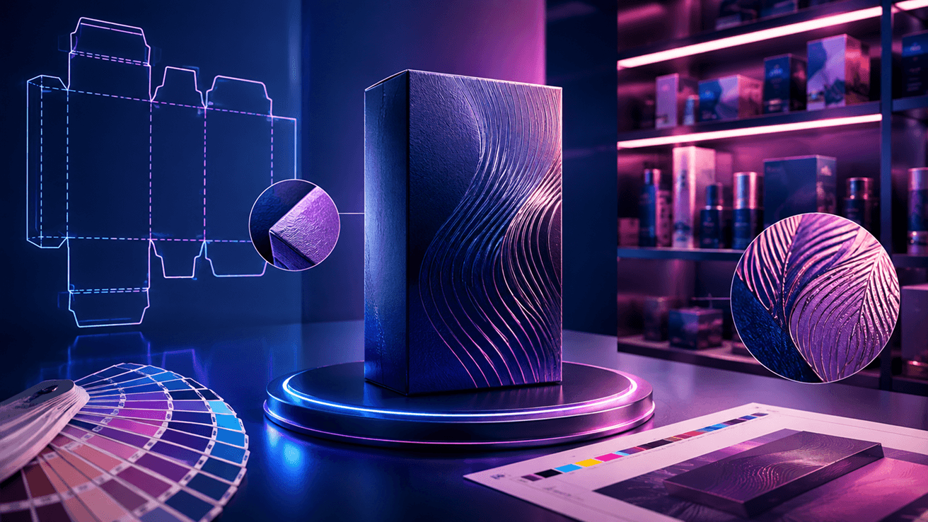
Let's take you through the dos and don'ts of packaging post-production.
1: Do: bridge the hidden gap between design files and physical packaging
A design can look breathtaking in a 3D render, and a single prototype might fit perfectly. But manufacturing in bulk units brings a completely different set of physical variables into play.
The Fix: Create a packaging prepress workflow which begins with keeping the end result in mind, that is, packaging post-production.
Premium packaging design cannot be seen on a creative alone. It requires a production-ready workflow where designers, packaging prepress experts and print partners collaborate from the outset to ensure the entire process looks and feels uniform, from design file to physical material. By validating artwork against real substrates, print procedures and production limitations early, brands can eliminate surprises way before products reach the shelf.
2 Don't: just obsess over creating distinct brand colours; ensure protecting them across every touchpoint
Today, Coca-Cola stands out as one of the most recognisable brands due to its characteristic bottle form and the striking red colour that is consistent throughout its assets.
A consumer may come across your product in a variety of forms, including a retail display, a digital ad, an e-commerce listing, a billboard, a glass bottle, a carton and on the shelf itself before making a purchase. If each touchpoint presents even a slightly varied version of your brand colour, the inconsistency, though may seem minor in isolation, has a high tendency to chip away at recognition, trust and brand recall value.
The Fix: Build colour consistency from screen to shelf.
Maintaining consistent brand colour across a glass bottle, corrugated box and digital banner does not happen by chance. It requires a unified and effective brand colour management strategy that begins at the creative development stage and carries through to final production.
Standardised brand colour management, calibrated proofing and close coordination with printers help ensure colour consistency packaging across substrates and production procedures. By recognising potential colour shifts before they reach the press, brands can safeguard visual consistency while avoiding expensive reprints and unnecessary delays.
3: Don't: treat finishing as mere decoration
Consumers treat finishing as a cue for quality. The more the design finishing looks premium, the better it will translate onto the packaging post-production.
The Fix: The most impactful packaging does not leave tactile finishes to the printer's discretion. By factoring embossing debossing, spot UV coating, foiling and substrate specifications into the packaging prepress workflow, brands can ensure the same refined experience at every touchpoint envisioned in the original design as intended.
The result is packaging that delivers a steady sensory experience at scale, reinforcing the premium perception consumers expect from the moment they feel the product in their hands.
Here's why packaging isn't just packaging; it is the decisive commercial moment:
In the year 2005, Procter & Gamble (P&G) coined the term "First Moment of Truth" (FMOT) to recognise the brief three to seven second window when a consumer encounters a product on the shelf for the first time and decides whether to buy it or leave it.
What's surprising is that even two decades later, this consumer mindset hasn't changed at all. However, brands have evolved with the changing times, at building awareness and retaining recall value through viral digital campaigns, striking celeb and influencer partnerships and seamless omnichannel experiences. Yet, the FMCG and beauty market thrives on physical, in-store experiences where consumer decisions are heavily based on what they see and feel while standing in front of the shelf.
What happens during the critical seconds that shape purchase decisions?
- A consumer notices the packaging.
- They intuitively judge its quality.
- They compare it with other similar products.
- They decide whether it is worth picking up.
All of this happens before the product is even opened. And, here's what this theory proves: premium doesn't end while designing retail shelf packaging on a screen. It is decided in the First Moment of Truth.
Every production choice, from brand colour management and substrate selection to embossing debossing and spot UV coating, either strengthens your brand's premium positioning or quietly weakens it. By the time a consumer notices that a carton feels of lesser quality than expected or a bottle doesn't quite match the campaign imagery standards, the moment has already passed.
Retail shelf packaging does not reward creative intent alone. It applauds flawless execution across packaging prepress, premium packaging design and packaging post-production.
Is building consistent, premium packaging across every touchpoint the next step for your brand?
Manipal Digital's Packaging Prepress service can help make that experience as memorable as your brand.

